Camp Midnight – Steven T. Seagle (writer), Jason Adam Katzenstein (artist)

Camp Midnight CoverFirst Published: 3rd May, 2016
Genre: Middle Grade Horror / Graphic Novel
Available: Amazon.com | Amazon UK

Skye doesn’t want to spend the summer with her dad and step-mother. It turns out they don’t want her around either, and send her to summer camp. A confusion means she ends up at Camp Midnight, where everyone is a monster. Except for Skye and possibly her new friend Mia.

This is a fun graphic novel, dealing with some difficult issues in an accessible way. Skye has been hurt by her parent’s divorce. She reacts by lashing out at everyone, without considering how her rudeness and sarcastic responses might hurt people. Something she has to face at the camp is how throw-away comments can end up hurting people, no matter what the intent.

The story runs through the whole time at the camp, from getting her choice of bunk on arrival to taking part in special events. The main focus is her friendship with Mia, though she also has to deal with the popular girls and a crush on a cute boy. The latter two aspects are nothing new, but the friendship with Mia is great. I was rooting for them both to find their place at the camp and beyond.

I liked the handling of consent issues. Mia doesn’t like being touched. Though she might sometimes be okay with it, sometimes she doesn’t want to. Skye accepts this and finds a touchless alternative to shaking hands. It’s nice to see a clear statement that if someone says no to something, you respect that, no matter how snarky you are.

I’m rather lukewarm on depictions of witches as fantasy monsters, but I don’t have any specific criticism here. The witch in charge of the camp is shown as a person and obviously cares about the campers. It’s not bad as such depictions go.

Each page has a limited colour palette, apart from an occasional frame intended to stand out. For example, one page may be greens and blues, and another page may be in oranges. This adds to the spooky atmosphere. The composition hints at monsters, with backgrounds forming faces and monstrous shadows. It’s well spaced, with a few panels on each page, and writing at a comfortable reading size. The art is a perfect match for the story.

This book is on the borderline between upper middle grade and lower young adult. The main themes are friendship and dealing with family issues, but there is some early teen stuff like her crush. It’s ideal for readers in that middling area.

[A copy of this book was received from the publisher for review purposes]

The Little Black Fish – Bizhan Khodabandeh (illustrator)

Little Black Fish CoverFirst Published: 15th March, 2016
Genre: Children’s Fiction / Graphic Novel
Available: Amazon.com | Amazon UK | Rosarium

The little black fish is tired of swimming in circles all day, so she decides to leave and find out where the stream ends.

This comic is an adaptation of the children’s book “The Little Black Fish” by Samad Behrangi. There’s a note at the end discussing some of the changes from the original material, though none of them are that major. The main flow of the story is the same as the original text.

I loved the art style in this. It’s very colourful with a lot of detailed patterns. The panel layouts are varied, which helps provide visual interest. The balance of text to art worked to make it clear what was going on.

As to the story itself, its strengths and weaknesses are down to the source material. On the plus side, it’s a tale of how one person’s achievements can inspired others. The frame story is a fish telling her children and grandchildren (I liked the nod to biological accuracy, as there’s a huge number of them) about the black fish’s adventures. It’s a story about striving to achieve your dreams and ask questions, even if others are sure you’re wrong.

It’s also interesting in a political context, as it touches on issues like people being shunned or killed to maintain the status quo, and attempts to suppress knowledge. As someone born to a working class family, feeling like life is swimming in pointless circles, and wanting to escape that, is something I can relate to.

There are aspects I did not like as much, and would make me hesitant to read this to a younger child. Crying is treated harshly. To cry makes you a cry-baby and a disgrace. The old are criticised for whining about things. The black fish is called crazy, and calls others ignorant in response. Though being called crazy is portrayed as a bad thing, it is the black fish who is saying others must not complain about things and are ignorant for not agreeing with her. Those are all things people throw at others to shut them up (stop whining, stop crying, you’re just stupid), which rather goes against the central theme of the black fish wanting the freedom to speak her mind and achieve her dreams. It’s a selective freedom for her, and people who think like her.

It’s also a rather simplified metaphor when it comes to the poor. A lot of people aren’t caught swimming in circles because they don’t believe there’s anything else, but because they can’t escape their circumstances. There isn’t an opening in the stream for them to swim down. Or if there is one, they’re not able to fit through it. This is implied with the lizard, as he offers support for the fish without going himself, but it’s not directly stated.

For an older child or adult, the story can be considered in the context of when and where the original was written. For a younger child, that’s going to be a bit over their heads.

I think this would be a great book for any fans of the original, as well as people new to the story. The comic adaptation does add something extra. But it is very much a story where knowing the context is important, as some of the morals of the tale are a little uncomfortable in a modern context. I’m all for telling people to strive for their dreams and to be inspired by others, but not so much that it’s bad to complain or cry when something’s hurting you.

[A copy of this book was received from the publisher for review purposes]

Mathematical Verse: Saloua Raouda Choucair

A wooden sculpture by Choucair

This is a small section of my art coursework, reviewing my visit to the Choucair exhibition at the Tate Modern. The overall coursework topic is “The Human Condition”, which is why the focus of the review is relating it to people. I figured it might be of interest to some of my blog readers.

Saloua Raouda Choucair (born 1916) is a Lebanese artist, known for her abstract art. I visited an exhibition at the Tate Modern, which covered her work throughout her career.

The first room displayed her earlier work, including pictures she’d produced whilst studying in France. Les Peintres Célèbres 1 has clear inspirations from Fernand Léger’s work (she studied at his studio), though the tone of the piece is different. Cubism and related styles are often violent to the subject, pulling them apart and reconstructing them. There is an overtone of hostility to the subjects. In contrast, Choucair’s women are organic and the scene is restful. That feel of domestic comfort acts as a critique of the work that inspired it.

Stepping away from her early work, her skill as an abstract artist is clear. Pieces such as Fractional Module show geometric shapes in bold colours, repeating and overlapping. There’s an influence from Islamic design, both in the patterns and the technique of starting with abstraction (rather than building up to it with figurative works first, as is commonly taught in Western art). Mathematical theory and poetry are common themes, giving the pieces a rhythmic tone. It’s a different approach to showing human experience than other artists I’ve looked at*, as she deals with the abstract aspects directly, rather than using the body as a focus.

Her wooden sculptures particularly interested me. Some are towers made of multiple pieces, but it wasn’t clear at first glance whether this was the case or how many pieces had been used. By forming the wood into complex interlocking shapes, each tower forms a new combined shape.

The later sculptures move away from the colour of traditional Islamic art, with the use of wire, metal and other plain surfaces. The wire structures still have a repetition of line and curve, but it’s coupled with a focus on tension and energy.

The exhibition as a whole was well presented, with a good balance of sculptures, paintings and descriptions placing them in context. I find exhibits that are too heavy in one sort of work harder to get around, as all the work requires the same kind of attention. (This is something I’ll keep in mind when it comes to presentation of my own work.)

Choucair’s exhibit was popular enough to be extended for a few more weeks, which is very rare at the Tate Modern. Yet her work** has rarely been shown outside of the Middle East. It’s a reminder of how slanted art history has been, where the contributions of European artists are celebrated, whilst the work of others is often dismissed and forgotten. Hopefully this exhibition will help ensure Choucair is remembered.

* The ‘other artists I’ve looked at’ refers to the ones in my coursework, rather than all artists I’ve ever seen.

** Her page at the Tate’s website has the pieces they own: http://www.tate.org.uk/art/artists/saloua-raouda-choucair-14735

The Tate Modern has a section about the exhibition I visited, with photographs and details of the work: http://www.tate.org.uk/whats-on/tate-modern/exhibition/saloua-raouda-choucair

# The picture is one of the wooden towers. It’s copyright to the Saloua Raouda Choucair Foundation, and is used for the purposes of review.

The Spots of Yayoi Kusama

Context

I went to the Tate Modern for the first time a little while back. I had a mild fever by the time I got home, so I took aspirin, laid down for a bit, then got up and write a story about artists and tentacle monsters*.

The fever wasn’t because I was sick. It was sensory overload. When I walk into a crowded room, it’s like I’ve walked into trippy dayglow land. My reactions range from general distraction, to seeing lights and shapes in front of my eyes. I used to think this happened to everyone, but I came to realise that for most people, a busy room is a plain and stationary affair.

Sensory overloads aren’t always bad. Art is something that sets it off in a good way. I may well see spots and have fever symptoms, but I enjoy visiting galleries. I’m attracted to bright colours, bold shapes and light rooms (where the room in dark, apart from points of light). Modern art has plenty of those.

This time when I visited the Tate Modern, I looked over the paid exhibitions**. I was immediately drawn to Yayoi Kusama’s work, as it it was bright and covered in polkadots. Finding out she had hallucinations***, which led to some of the repeated images, made me even more intrigued. I don’t think she sees things for the same reason as I do (there’s no discussion of sensory overloads in the interviews), and I’ve never felt the things I see were real (they’re translucent, like an overlay on reality), but I was curious to see how it influenced her art.

Infinity

The art is mostly laid out in chronological order. Her early paintings are smaller abstract works, with a focus on colour and patterns. Once she’d moved from Japan to America, the canvas size gets bigger. One room is taken up with ‘infinity nets’ – repeated white circles on large canvases. These wouldn’t translate well as prints, but full-sized on every wall of a room, they have a calming effect. It reminded me of being on the beach on a calm day, as the infinity nets had a similar sensory impact to waves.

She also moved onto sculpture, being known for covering everyday things with items that caused her anxiety. The ones people focus on represent her anxieties about sex, but I noticed the clothing covered in flowers. Sex is not an uncommon anxiety. The objects with pasta on aren’t a surprise from someone risking starvation in a country with plenty. But flowers struck me as a more unusual thing to be anxious about. Some of her interviews mention seeing fields of flowers as an example of an infinite thing – that the flowers go on forever. For me, the fear/wonder that comes with imagining the true scale of things made for a more interesting sculpture. But I guess for most, sex sells more than infinity flowers.

Her later pictures included collages, which have a melancholy feel to them. This shifts slowly into her most recent work – bold acrylic paintings with a cheerful feel (something I’ve seen criticised… but I don’t view happy emotions as less artistically worthy than sad ones).

The highlight of the display were the two room installations (both of which I’d call light rooms). “I’m Here, but Nothing” is a dark room, set up like a room in a house. Fluorescent spots cover everything, lit by a UV lamp. Though you can see the items in the room with the faint light, the glowing spots dominate. From my perspective, it was like an inversion of sensory overloads, where the spots are no longer the overlay. They’re the reality, and the room is the unreal layer.

The second light room was “Infinity Mirrored Room – Filled with the Brilliance of Life”. It’s covered in mirrors, with multi-coloured lights hanging down. The lights shift through various colours, creating an endless expanse of lights in the mirrors. Almost like a starscape.

Reflections

Armed with a copy of Alice in Wonderland (illustrated by Yayoi Kusama), I headed home. The family member who came along got a collection of postcard prints (we did the shop before heading in, so also played the game of spot the original in the exhibition). The gnarly mutant polkadot pumpkin cushions were out of my price range, but fun, as only gnarly mutant polkadot pumpkins can be.

It sounds strange to say, but I hadn’t considered why I tend to put spots all over things. My spots are much smaller and not of the polkadot variety – often they’re smallest dot I can make with whatever media I’m using. But they’re there. I suppose because I’ve always been aware that the spots aren’t really there, I didn’t consider why I was making them real in my pictures.

* This story was “Visions of Destruction Series, Mixed Media”. On the first visit, there were a lot of art series on display.

** The Tate Modern itself is free, but the special exhibitions need paid tickets. I recommend booking in advance. The ticket collection queue had about ten people. The ticket purchase queue went all the way to the main door and back again. I was glad we’d booked.

*** One criticism is that Kusama apparently didn’t discuss having hallucinations with friends when she was younger. Some take this to mean she didn’t really have them. But not only is it difficult to discuss seeing things that aren’t there (people don’t exactly take the news well most of the time), it’s not immediately obvious that it isn’t something everyone experiences. We tend to assume we experience the world the same way as everyone else, until proven otherwise. Saying, “Well, of course it’s obvious people don’t see spots, because I don’t,” is proving the point.

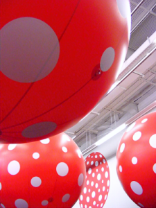
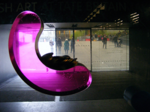
# The Tate asks for people not to take photographs in the ticketed exhibits, and to only use photos taken in the other galleries for personal use. I’m honouring that request… however, I have included two pictures taken outside the main galleries. The polkadot beach balls were dangling down outside the Yayoi Kusama display and the colourful perspex is the donation thingy at the main entrance. Pictures from the exhibition itself can be found on the BBC website and more information about Yayoi Kusama is on her website.