 Developer: [bracket]games
First Release: 20th March, 2015
Version Played: PlayStation 4
Available: PS Store US | PS Store UK | Steam
Kelly talks to her family on the phone as she drives home through a storm.
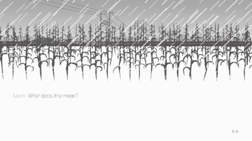
This is a simple interactive story. The main story is the drive, though the extended edition also includes an epilogue and some extras. The art looks like monochrome cutouts, with the background shifting to reflect the conversations. It’s a simple and effective style. My main issue is the text was grey on white with rain cutting across it, which is not very readable.
The player chooses dialogue options during the drive to change the direction of the conversation. Choosing an option makes that what happened, such as deciding what happened when Kelly left home earlier in the day. There shouldn’t really be anything to go wrong with gameplay this simple, but the player has to hold down one of the trigger buttons for the entire game. When the button is held down, the car drives forward and the conversations continue. When it’s released, the game pauses. This is not an accessible design decision, as it can cause wrist and hand problems. I did like the way everything froze in time when it paused, but this could have been done with a single press to start the car and another press to stop it.
That criticism aside, it’s an interesting game. It’s a quiet story of family relationships. Kelly has been away from home and not kept in contact, so she’s got a lot to talk about.
Image Caption: The top part of the screen has cutout-style art. Dark grey corn is in the foreground and background. A car drives along a road in the midground. In the distance, there are lighter grey power lines. White rain cuts across the image. The lower part of the screen is white, with the text: “Mom: What does that mean?” in grey with white rain cutting across it.
Mom is very critical of Kelly. It’s easy to see why Kelly avoided contacting home. Though it may come from a place of concern, it’s still done in a way that isn’t good for Kelly.
Kelly’s younger brother is Ben. It’s not stated directly, but he appears to be autistic. He has difficulty gauging the emotional reactions of the rest of the family. He’s very focused on certain interests. This might come across as a little simplistic in representation, but Ben’s stories help add some depth. He tells one story during the drive. The extras include a few more of these stories, which have themes like a sister going away forever and family problems. It’s made clear that Ben is noticing what’s happening and does care. He’s just having trouble expressing it. I did like that his interests included creative things, and changed over time, rather than assuming autistic people have one true interest forever and that interest has to be maths.
Dad had an accident at work that led to a leg amputation. Talking to him can reveal some of the issues he’s facing, such as pain management and trauma from the accident. There’s some discussion of alcoholism.
Kelly is partly shaped by the player choices, though there are things in her history that can’t be changed. The epilogue works well to expand on Kelly’s life, as it deals with the time before she came home. She’s very self-critical, in a way that doesn’t match up with reality. For example, her thoughts on her assignment are far worse than the actual assignment and teacher’s comments in the extras. A nice touch in the epilogue is the player can decide if Kelly’s partner is a boyfriend or a girlfriend. Mom does not comment on that, outside of being surprised that Kelly is dating.
It’s a short game and can be played multiple times. There are different branches through the conversations, though not to the point of it entirely changing the story. The ending is set and it’s not a happy one. This is also my main comment when it comes to the disability representation. It’s not that I had a big issue with how the characters were portrayed, as they came across realistically. But this is ultimately a tragic story, which tends to be typical rather than the exception when it comes to disabled characters. The game also lacks accessibility options, such as darker text and alternatives to holding down the drive button. Those things combined mean I liked it well enough, but not enough to go through the hand pain it causes.

 First Published: 5th April, 2016