Palia (Closed Beta)

Palia in white fancy text with beta below. The background is a green natural landscape with deerlike animals drinking from a river.Developer: Singularity 6
First Release: 2023 (Beta)
Version Played: PC Closed Beta

Humans disappeared from Palia long ago, leaving behind their ruins and the mystery about what happened. You’re a human and suddenly appear at the ruins. Time to meet the locals.

Palia is a cozy MMO with a focus on things like crafting and exploring, rather than combat. There are bows and animal hunting, but that’s as combat-oriented as it gets. Player characters don’t have hit points and simply respawn if they jump into dangerous places (like deep water).

The closed beta has two main areas and also the player housing (everyone has their own instance of the housing plot). I got lucky with closed beta access, so these are my thoughts on that.

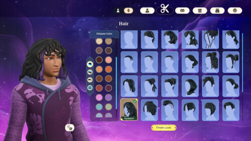
It all starts with character creation. There are two body types (A and B) which have a set of faces linked to that body. Everything else can be used on either body. That means any voice, hairstyle, clothing or makeup. The basic selection has options for different races, including being able to have a hijab for those who want to cover their hair.

Though the body types aren’t assigned a gender, and being able to put any of the stuff on them is great, they are still rather binary in their overall shape choices. I would like a few more bodies to choose from. Or the option to choose between flat chest or breasts on the current bodies. Given the range of body types in the NPCs, I wouldn’t be surprised if this happens at some point.

Character creator screenshot

Image Caption: The character creator for Palia has a starry background with the interface on top. A range of hairstyles are shown, including straight and curly hair, braids, locs, and a hijab. A colour selector has a mixture of natural shades and other colours. The character is on the left, showing the selected wavy curls hairstyle.

The way the skills are handled in the game works well. These skills are things like growing crops, fishing, bug catching, hunting, mining, chopping down trees and furniture making. What’s nice here is that very little grinding is required. Once I had a feel for where to get all the materials, I’d wander around collecting whatever was around. A bug here, a tree there, maybe some mining.

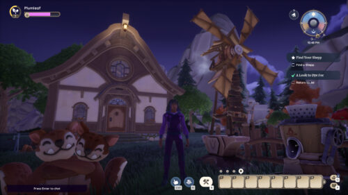
Housing is introduced very early, so I quickly started on growing some crops and setting up crafting stations. This housing area starts with some harvestable resources (trees, rocks and mushrooms) and has a private pond for some fishing. The full buildable space needs to be unlocked during play, but it’s a good size that’s clearly intended for an endgame of decorating the whole thing.

Star quality (literally marked with a star in inventory) bugs and fish can be placed as pets, so my endgame will involve whole rooms full of pets, as that’s just how I roll.

House plot screenshot

Image Caption: My character stands on the housing plot at night. The character has brown skin, black and purple curly hair, and purple clothing with a leaf pattern. A small building, fenced area with crops, windmill, work stations and two cuddling plushies, can be seen. The game interface is shown, with an inventory bar, compass, quest objectives and focus bar.

I appreciated little things, like crops not dying if they run out of water (they simply pause growth) and decor not taking up any storage space. If multiple players hit the same harvestable resource, everyone gets the full loot. These design choices help to make things more relaxed.

I also enjoyed the story so far. Humans appear with only the memory of a starry void and a reassuring voice (this is the setting of the character creator). Some quests are about visiting ruins, with a focus on exploring and solving puzzles. There’s obviously more going on here about what happened to humans and how it’s connected to the flow (a form of magical energy).
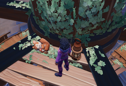
Exploring screenshot

Image Caption: My character is in a derelict tower with holes in the wooden floor and ivy growing on the walls. A lantern and plushie are on the floor. The toy is a cute animal cuddling a mushroom. I want that toy.

The NPCs have lives and wander around (press m for the map to see where they are currently). Every NPC has a friendship quest line and some also have a romance quest line. These quests provide more information on the various characters and the world. Only thing I’d say here is the NPCs are purple elf people, anthro cats and robots. It’s a pity that players have to be human and can’t unlock any of those appearance options.

It’s a multiplayer game, but the current system isn’t good for people who want to directly play together. For those who try teaming up, it’s tricky to get on the same server/instance. Groups find they get split up if they change to a new area.

This means that though other players are around, it’s mostly a game for parallel play: most people play alone near each other, rather than with each other. Some resources actively need many people, such as cutting down the flow trees, but this tends to happen in an impromptu way. There isn’t a reason for the gang to stay together once it’s done.
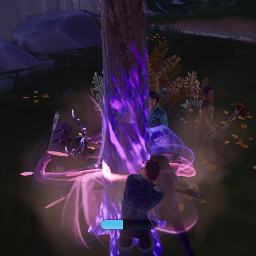
Flow tree screenshot

Image Caption: Multiple characters swing axes at a purple glowing tree. The tree’s health bar shows it’s taking damage.

Housing could have some potential future issues, as access is restricted. Friends can visit, but particularly as the game ages, people will want to show strangers their awesome decorations. I hope that something like the Animal Crossing dream codes might be introduced for that.

The controls are usable, but more the sort of thing I associate with console games that have been moved to the PC. The mouse controls the camera and the keys control movement. There aren’t options to lock the camera behind the avatar or to turn left/right (the camera has to be pointed in the direction of travel).

Options include things to reduce motion sickness. Most game information is text, but it would have been good to have subtitles on the speech in the character creator and the intro/exit speech of the NPCs. An option to click to start/click to stop would be nice for skills, rather than having to hold the mouse button. I can cope now, but holding down buttons was very painful at the height of my arthritis, so this will be a challenge for some gamers.

In very important news, you can pet the dog. It’s an option that comes up sometimes when you’re talking to him, though there isn’t an animation that goes with it.

The game succeeds at being cozy. The current content is a solid foundation with room to expand. It may not appeal to people who want a team game and some of the controls are not the best. In the end though, it’s free and I’m finding it fun, so I’m here to stay for a bit. I’ve got carrots to harvest.

(Shameless plug: Everyone gets a refer-a-friend link, which earns special items in the game. Here’s mine if anyone wants to sign up an account. Open beta started on 10th August 2023, so anyone can sign up now. I’m not being paid for this, I just want the cute fountain: Palia Account Signup)
Thunderbird Strike

Thunderbird Strike LogoDeveloper: Elizabeth LaPensée
First Release: October, 2017
Version Played: iPad and PC
Available: Apple iOS | Android | PC (Direct Download)

A thunderbird uses lightning to destroy a snake (an oil pipeline) consuming the land.

This is a short sidescrolling game, focusing on the theme of oil pipelines being built on Indigenous land. There are three levels, one of which is a boss fight. Each level has a brief animation to introduce it. I initially tried the iPad version, but that was too glitchy to play. It crashed either at the end of the first level or the end of the second level introduction animation. This was consistent, so I couldn’t play beyond the first level on the iPad. I didn’t experience any crashes on the PC version, which is the one I played to the end.

I liked the general concept of the levels. The thunderbird flies into the clouds to gather lightning. The lightning can then be fired to destroy industrial items or to restore living things. There’s no damage or death for the thunderbird, so it doesn’t matter how well the player does. This is a good feature for a gamer who wants to experience it, but may not be too good at controlling the bird.

However, there were elements I didn’t like in the gameplay. There’s no charge meter for the lightning, which makes it difficult to tell when the bird needs more lightning. There is a sound when it runs out completely, but that doesn’t help much for players who don’t use sound. There is a crackling visual, but it’s subtle, and isn’t really usable on devices with touchscreens where fingers cover the bird. It is also hard sometimes to see if the lightning has hit, which was particularly an issue in the boss level where I didn’t appear to be able to do any damage at the start, and I have no idea why it wasn’t working.

I do wish there’d been a few more levels. It felt like I was just getting going when it ended (and the points on the snake map suggest this might have been the intention, as there are more points than levels).

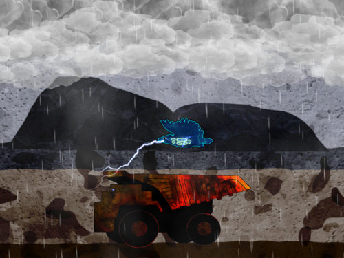
A scene from Thunderbird Strike

Image Caption: A blue thunderbird fires lightning at an industrial vehicle. Rain clouds are above a bleak landscape with mountains in the distance. The art is 2D with outlines on the main subjects and textured fills and backgrounds.

The strongest element is the art. It’s a beautiful style, with clear outlines and textured fills. As the outline moves, the texture stays in place, which is a nice effect. The destroyable items are industrial machines and pipes. Activatable items include animal skeletons and pipeline protestors. Each level has a distinct visual theme.

The weakest area is the sound, which doesn’t fit very well with the rest of it. The spoken words are more like a retro fighting game, with announcements of “fatal strike” and similar. The music doesn’t match where it appears. For example, the first level has a stirring boss fight feel to the music. Added to this, there are no options to turn sound elements off or down.

Overall, it’s a good concept for a game. I really liked being able to repair the damage with the lightning, as well as destroy the industrial things. The artwork and animation were good. But it is a little rough around the edges, particularly when it comes to the sound design and the crashing issues with the iPad version.

Everything

Everything Game LogoDeveloper: David OReilly
First Release: 21st March, 2017
Version Played: PlayStation 4
Available: PS Store US | PS Store UK | Steam

You are everything and everything is nothing.

This is a simulator where you can become any of the things in the game. You start as an animal (I was a sheep). Wandering around will yield guidance on how it works and new abilities will be unlocked. Alternatively, you can leave the controls and let the game play itself, because the game doesn’t need the player to guide it. This would be an odd choice in most games, but it fits the themes well. Nothing is more essential than anything else, and that includes the player.

The art and animation choices are immediately apparent. The models are low detail and the land animals don’t animate. Instead, they either roll over end to end or skitter along, like they were toy animals being pushed by a child. Some things do have basic animations, such as birds flapping their wings and plants growing. I mostly didn’t have a problem with the animations, but the blur when ascending/descending into things did cause some motion sickness. I did like that the thunder storms didn’t have bright flashes of light (I’d note for those with flash issues, some of the disasters are a bit flashy, but they can be turned off).

Once the ability to ascend/descend to different scales is unlocked, it gets a whole lot more interesting. You can descend into the grass and then the microscopic level. You can ascend to continents, planets and galaxies. As the game continues, you get abilities that mean being able to change the size and type of thing, should you want to do so. I released giant geckos on one continent and left miniature planets between cracks in a city pavement.

During all this, it’s possible to listen to the thoughts of some of the other things. These are collected and used to generate your own thoughts. Those generated thoughts range from nonsensical to the inadvertently profound.

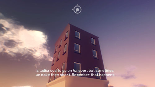
Everything Screenshot: Thoughtful Flats

Image Caption: I’m a block of flats framed against the sky and having a thought constructed from the thoughts I’ve heard. The thought reads: “Is ludicrous to go on forever, but sometimes we make them short. Remember that happens.”

The narration is from a series of lectures by the philosopher Alan Watts. They were recorded between 1965 and 1973. His lectures deal with the general nature of reality, and that divisions are something that people create, rather than an innate part of the universe. At the same time, there are also elements of the lectures that are dated. Despite talking about how divisions are culturally constructed, he still considers men and women to be inherently opposite and unknowable to each other. Trying to explain anxiety disorders in terms of a philosophical crisis also really doesn’t work. The lectures weren’t anything new to me in terms of basic concepts, but they were interesting from a historical perspective. He’s a good speaker who explains his ideas clearly.

There aren’t many set goals in the game, as it focuses more on being a sandbox. There is the tutorial to complete, though it’s somewhat more lengthy and involved than most things labelled as tutorials. I enjoyed the ending and the unique area for the tutorial. Broader goals are to complete the catalogue of different things and listen to all the narration. I hit a few issues with collecting all the things, as some of the things disappeared from my universe. This can be solved, as each area can be reset to its starting point, which brought them back.

Everything Screenshot: Rolling Unicorns

Image Caption: I’m a herd of rolling white unicorns on a purple alien world with giant bacteriophages. The white circle at the top is the game interface.

I enjoyed wandering around to find the things and listening to the lectures. It was interesting to see a game with world/universe simulator themes, but not from a perspective where the player is a deity looking down on the playing area. The player is an ordinary thing in the universe and manipulates it from that position. Time does not go faster or slower based on global game settings, but by becoming things with different perceptions of the passage of time. The exploration side appealed to my love of walking simulator games, as there were a number of environments to explore.

However, there are some weaknesses. The vehicle behaviour has some issues, which means cars get stuck running down the river instead of on the road. An area has train viaducts, but the trains run on the grass next to them. Also, some scales are a little sparse on things. This is particularly true of the larger scales. It would have been nice to see some gas giants and a wider range of stars. The range of options to customise the experience was mostly good, but an instant alternative to the ascend/descend blur would have been a useful accessibility feature.

This game will appeal to players looking for an experience to wander around in. It’s not a game for players looking for strong narratives or structure. Note that it does discuss themes like death, and some things have thoughts that are suicidal or self-hating, so it may not be the game to play when needing a break from that.

Feesh

Feesh LogoDeveloper: Terrifying Jellyfish
First Release: 2nd February, 2016
Version Played: PC (Steam)
Available: Steam

You are a microscopic feesh in a feesh-eat-feesh world.

The original version of this game was coded in two days, though the version for sale has other updates. The basic premise of the game is simple. The tiny feesh has to eat smaller feesh to grow in size, whilst avoiding being eaten by bigger feesh. Some have special skills, such as producing child feesh. Some are more aggressive than the rest, such as the sharks that will track down the player feesh.

Arcade mode is the main one I played. After reaching a certain size, the feesh evolves into a different type. My main criticism here is that this doesn’t unlock the new type permanently. I’m never going to be good enough to play through all the different creatures in one game, so it’d be nice if I could start with a later creature. That way, I’d have a chance to eventually play all the available types.

Shark attack mode has extra sharks and doesn’t last very long. I couldn’t do multiplayer as I only have one keyboard/mouse, but it’s a local versus mode. Chillout mode is like a screensaver, where all the feesh do their thing without any player control.

I liked the way the other feesh are doing the same thing as the player feesh. Sometimes one of those feesh will end up growing very large, as they successfully manage to eat loads of tiny feesh. It creates the feel of a working ecosystem, where the player is no more important than any of the other feesh. Eaten feesh respawn elsewhere, so there will always be other feesh around to continue the game.

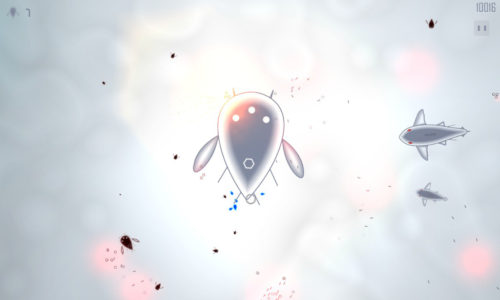
Feesh Screenshot

Image Caption: The player feesh is in the centre. It’s a grey teardrop shape with three white eyes at the rounded end and a hexagon at the pointed end. It has two larger fins and a number of other lines sticking out of it. Several smaller black feesh surround the player fish. Two sharks are approaching from the right.

The art style is fairly minimalistic with a whimsical flair. The main feesh, and some of the others, look like microscopic creatures. Others, like the shark and crayfeesh, are based on larger fish and sea creatures. It’s not scientific, but it clearly isn’t supposed to be. You’re a feesh and the world is very silly. I’d note there are some flashes of light at times, though it’s more of a gradual increase in light rather than a strobe effect.

This is the sort of game for playing a round in odd moments. It doesn’t have a whole lot of depth, but what it does have is nicely done. It’s cute and I enjoyed the feel of the art and the funny descriptions of the feesh. It’ll be interesting to see how the developer tackles larger projects. Hopefully that sense of whimsy will be carried though.

Three Fourths Home: Extended Edition

Three Fourths Home LogoDeveloper: [bracket]games
First Release: 20th March, 2015
Version Played: PlayStation 4
Available: PS Store US | PS Store UK | Steam

Kelly talks to her family on the phone as she drives home through a storm.

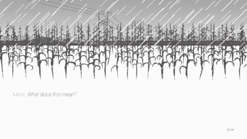
This is a simple interactive story. The main story is the drive, though the extended edition also includes an epilogue and some extras. The art looks like monochrome cutouts, with the background shifting to reflect the conversations. It’s a simple and effective style. My main issue is the text was grey on white with rain cutting across it, which is not very readable.

The player chooses dialogue options during the drive to change the direction of the conversation. Choosing an option makes that what happened, such as deciding what happened when Kelly left home earlier in the day. There shouldn’t really be anything to go wrong with gameplay this simple, but the player has to hold down one of the trigger buttons for the entire game. When the button is held down, the car drives forward and the conversations continue. When it’s released, the game pauses. This is not an accessible design decision, as it can cause wrist and hand problems. I did like the way everything froze in time when it paused, but this could have been done with a single press to start the car and another press to stop it.

That criticism aside, it’s an interesting game. It’s a quiet story of family relationships. Kelly has been away from home and not kept in contact, so she’s got a lot to talk about.

Game screenshot

Image Caption: The top part of the screen has cutout-style art. Dark grey corn is in the foreground and background. A car drives along a road in the midground. In the distance, there are lighter grey power lines. White rain cuts across the image. The lower part of the screen is white, with the text: “Mom: What does that mean?” in grey with white rain cutting across it.

Mom is very critical of Kelly. It’s easy to see why Kelly avoided contacting home. Though it may come from a place of concern, it’s still done in a way that isn’t good for Kelly.

Kelly’s younger brother is Ben. It’s not stated directly, but he appears to be autistic. He has difficulty gauging the emotional reactions of the rest of the family. He’s very focused on certain interests. This might come across as a little simplistic in representation, but Ben’s stories help add some depth. He tells one story during the drive. The extras include a few more of these stories, which have themes like a sister going away forever and family problems. It’s made clear that Ben is noticing what’s happening and does care. He’s just having trouble expressing it. I did like that his interests included creative things, and changed over time, rather than assuming autistic people have one true interest forever and that interest has to be maths.

Dad had an accident at work that led to a leg amputation. Talking to him can reveal some of the issues he’s facing, such as pain management and trauma from the accident. There’s some discussion of alcoholism.

Kelly is partly shaped by the player choices, though there are things in her history that can’t be changed. The epilogue works well to expand on Kelly’s life, as it deals with the time before she came home. She’s very self-critical, in a way that doesn’t match up with reality. For example, her thoughts on her assignment are far worse than the actual assignment and teacher’s comments in the extras. A nice touch in the epilogue is the player can decide if Kelly’s partner is a boyfriend or a girlfriend. Mom does not comment on that, outside of being surprised that Kelly is dating.

It’s a short game and can be played multiple times. There are different branches through the conversations, though not to the point of it entirely changing the story. The ending is set and it’s not a happy one. This is also my main comment when it comes to the disability representation. It’s not that I had a big issue with how the characters were portrayed, as they came across realistically. But this is ultimately a tragic story, which tends to be typical rather than the exception when it comes to disabled characters. The game also lacks accessibility options, such as darker text and alternatives to holding down the drive button. Those things combined mean I liked it well enough, but not enough to go through the hand pain it causes.