Recently in one writing community, a new person arrived and declared themselves amazingly talented. Their other online bios said they were special and unique. The reaction was a certain amount of bogglement, to say the least.
This is the issue self-published books face. Everyone knows the author wrote the summary on the back*, so the usual marketing fluff sounds hilariously unaware at best. Most authors deal with it by writing as little as possible, which is going to harm their sales, because it leaves the reader with little idea about the book.
So what can go on the back, if declaring myself to be an amazing writer is off the cards**?
I tackled it in a similar way to covers, by going out and reading descriptions for short story collections (and a few anthologies). My thoughts aren’t rules set in stone. Someone else may prefer an entirely different sort of back cover. But these are the things that I felt worked, or didn’t, when it came to telling me whether I wanted to buy the book.
Sections of the Summary
These are the main areas I found in summaries. They appear in different mixes in effective summaries, but I didn’t find any I liked that missed out summaries of the stories inside. After all, I’m buying the collection for the stories, so it better say something about them.
1. Author Name
It sounds obvious, but a lot of self-published collections missed this piece of information. It’s on the cover, yes. But it still helps to state it directly in the product description, so it’s clear it’s a collection of stories by one person, and not an anthology.
2. Genre and Themes
This might refer to the author or the stories. Genre writers have this one easy, as it’s where the book would be placed in the bookstore (romance, mystery, fantasy, etc.), with perhaps a modifier like humorous, dark or experimental. It’s a little trickier with books that don’t easily classify, but experimental, interstitial and cross-genre are all possibles.
Some descriptions avoided this direct reference, and tried to rely on descriptions of the story content. The issue here is some left me uncertain about the overall genre. Stories about dark secrets could be literary fiction about people’s past traumas, mystery stories about serial killers or paranormal stories about werewolves. So which is it?
Making up genres also doesn’t help. I know people like to believe they’re created something all-new, which couldn’t possibly be described in basic terms, but how many readers will search the online store for spacehamsterpunk?
3. Statistics
The ebook age has changed the needs of the summary somewhat. In a physical book, you can see how thick the book is, so you know roughly how many words are inside. In the digital world, a collection could be anything from three short stories to fifty. The reader needs some idea of length, so they can judge whether it’s good value for money.
Self-published authors win on this point, as even the shortest description tended to include the number of stories and their length category (five short stories, three novellas, and so on). Some of the trade published books have yet to catch up.
4. Story Summary
This is likely to be the biggest part of a lot of back covers. It’s a way of going past a basic genre tag and showing what the author writes about. A few common ways:
Story description: A cat grows a fish tail and swims across the Atlantic, to be reunited with her owner.
Character lists: A sentient potato, a pink mushroom and a lump of coal find happiness in this collection of twelve romance stories. Character lists worked the best for collections with unusual characters. A college graduate, a house spouse and an office worker aren’t as eye-catching. The lists also tended to be part of a sentence with some other elements (like the genre and number of stories).
Character plus story: A cheerleader has a dark secret. A squirrel is chased by the ghosts of acorns. This combines the character list with a bit of story, but not as long or detailed as the single story description.
There wasn’t one true way of making these work. The back covers I liked the best all had some story summary, but different combinations work best for different books. The biggest failing of this part is some descriptions tried to summarise every story in the collection (or as many as possible). In general, this worked best with a maximum of three descriptions in a row, or three items in a list. More than that started to drag. It’s understandable if it was a collection of four novellas to include a description of all four, but ten in a row is too many.
5. Author Achievements
Not every author has achievements, but when they do, it helps. Someone with professional publications or award wins is expected to be able to put out coherent prose. However, some back covers tried to use achievements to carry the whole collection. It doesn’t matter how many awards someone has won… if I don’t know the author and there’s no suggestion of the type of stories in the book, I won’t buy it.
6. Quotes
Established authors often have quotes from reviews or other authors. Personally, I find these useless for buying books. They take up space with waffle about how great the author is, without telling me what the author actually writes. Someone obviously likes them, as they’re common, but I skip these. When a back cover is mainly quotes, I’m moving on to the next collection.
7. Table of Contents
An optional extra for short collections is to include the table of contents after everything else. This is more common for online product descriptions than the back cover of printed books, and works best for collections with only a handful of stories. I don’t think anyone would expect a collection with thirty stories to list them out.
Back Cover Issues
Order and Weight
The order of the elements mattered. If it started with three quotes from other authors, I would have moved on as a reader. I only read to the end because I was analysing them. If it ended with those same three quotes, it wouldn’t have mattered as much.
Some descriptions were also a bit too in love with one element, such as listing author achievements and not much else. Yes, it’s nifty they’ve done all those things, but if no space is given to the stories, it won’t attract new readers.
Vagueness
Some summaries had an attack of the vague. Everything’s amazing, ground-breaking and awe-inspiring, but nothing got more specific than that. What’s the book about exactly?
I Hate my Genre!
It’s a fantasy story, but it’s totally believable, unlike those other fantasy stories. It’s science fiction, but there’s no science in it, so it’s like it could be the modern world. It’s romance, but without any of that love stuff. Apparently it needs to be said this isn’t a good idea. Readers generally like the genres they read. Why would they read a book written by someone who hates them?
Repeat Everything
Repeats were often not the exact same word, but similar enough. Mythic, mythical or myth-inspired. Dark, darkness and darkened. This doesn’t always pop out as a problem, in that it reads okay when the words are spread out, or someone changed darkened to shadowed. But it means the description misses the chance to introduce a different aspect of the collection. If I replace one of the darknesses with melancholy, it’s given me an idea of how the collection is dark.
Oh, the Humanity!
A surprising number of books assure the reader it’s about humans. Or if it’s not about humans, it’s about humanity, the human experience, or some other way of saying it’s all about humans. Generally, I think it’d be safe to say people will assume the book is about humans. Or of it’s about non-humans, that it won’t be so mind-bogglingly incomprehensible a human can’t understand what’s going on.
I’m never again going to be able to read a cover mentioning the human experience without laughing.
But other than adding to my general level of mirth, you’re also filling up space with a rather pointless message. Shock news: there are humans in this! Actual real ones who do human stuff!
Nobody’s Perfect
The summaries I liked best were not perfect. Some summarised a few too many of the stories. Or they started with a rather vague review quote. Or they didn’t say how long the book would be. But I would have bought the book, if I was looking for that sort of story, and that’s ultimately the goal.
It’s important to keep in mind, because trying to make things perfect can lead to stripping out any voice and soul from it. A back cover won’t work for everyone. It mainly needs to work for the target audience and it only has to work enough for them to want the book. I’m sure some instances where the summary was over-long or repetitive were due to trying to answer all the questions critiquers had (because I’ve seen the exact same thing happen to queries).
My Back Cover
Putting this all together, I came up with something for my summary. Here’s how it ended up:
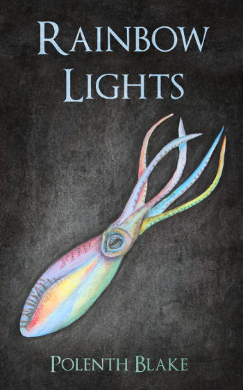
A deep-sea robot tells stories in every colour, but no shade can describe meeting a giant squid.
Rainbow Lights is the first collection by science fiction and fantasy author Polenth Blake. Alien scorpions, vampire ice cream sellers and clockwork flies, try to find their place in worlds where being human is optional. These thirty-five stories and poems are a mixture of new pieces and work published in venues like Nature, Strange Horizons and ChiZine.
And here’s why:
A deep-sea robot tells stories in every colour, but no shade can describe meeting a giant squid. [Leading with something storyish seemed a good idea, as the back cover is mainly for buyers who don’t know who I am. It’ll be down to whether the stories sound interesting.]
Rainbow Lights is the first collection [Not compulsory, but it sounds shiny and new to be the first one… if it were the tenth and they’d never heard of me, they’d wonder] by science fiction and fantasy [I have genres!] author Polenth Blake. [And also a name. This gets the basic stuff out of the way.]
Alien scorpions, vampire ice cream sellers and clockwork flies, [I aimed to make each part do as much lifting as it could. The character list gives an idea of the range of sub-genres (as it implies science fiction, steampunk and urban fantasy), along with a liking for invertebrates and quirky things (unless ice cream becomes the next big thing for urban fantasy, I think it’s safe to call it quirky)] try to find their place in worlds where being human is optional. [Okay, I’m having a joke at the expense of human experience summaries. But there really are non-humans, so it works whether anyone shares my sense of humour or not.]
These thirty-five [I really hope I counted them correctly] stories and poems are a mixture of new pieces and work published in venues like Nature, Strange Horizons and ChiZine. [I write well enough for people to pay me, and these also come with some genre implications, as Nature is hard science fiction and ChiZine is dark/horror. I have range, or something like that.]
And there we go. Someone did suggest I mention my imaginary goldfish on the back cover, but I’m saving that for the author bio.
–
* Though I’m calling it the back cover summary, it’s also the product description for online stores. It’s sometimes called the blurb too, but I’ve seen that used to describe quotes from other authors about the book, and that’s not what this post is about.
** Not that it was ever on the cards. I’ve always hated job application cover letters, where you’re supposed to say you’re reliable, hard-working and the best person for the job. I’m cursed with a certain amount of honesty, so I know I’m not the best person for the job, and no more hard-working and reliable than the other candidates. My solution was to achieve things, so I could list achievements, rather than talk about how wonderful I was. It’s helpful to have something else to waffle about.


