Rainbow Lights: Analysis of Rainbow Covers

Colour Wheel

Usually covers have a limited colour scheme, using shades of one colour, two colours that work together (either because they’re close together or dramatic opposites), or a bold tri-colour scheme using the primary colours. This is mainly because it’s very easy to make rainbows look like a unicorn vomited on the book.

Which is all very well, but the theme for my collection is rainbows, so an all-green cover wouldn’t exactly fit (no matter how lovely). I want to avoid any of the unicorn-vomit pitfalls, but I also want a rainbow. So before starting my own cover, I looked at other artwork using rainbows. These are my thoughts about using that colour scheme effectively.

Rainbow Rules

My first step was a visit to Google images. I searched for terms like “rainbows” and “rainbow lights”. A few observations on the pictures that came up are as follows:

  • Some images used the vomit method on purpose, such as psychedelic artwork and digitally edited photos of rainbows. These are intended to overload the viewer. There’s nothing wrong with that, but for a book cover, it’d detract from the details you want the viewer to see (the title and the author).
  • For non-psychedelic works, the most effective had de-saturated backgrounds, such as black, grey or a greyish shade of a colour. This made the rainbow stand out and also solved the visual overload problem. White backgrounds were also used for a brighter feel, but the rainbow stood out less against them.
  • Some focused mainly on one or two colours, with only small amounts of the rest. This gave the feel of the rainbow, without too much of a colour explosion.
  • The central colour would often appear to dominate at first glance, even if it was in the same quantity (or less) than the rest.
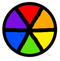
  • For contrasting areas, some used rainbow opposites. What I mean by this is they’d pair the opposite ends of the rainbow – red and violet. Usually in art, you’d use the opposite on the colour wheel* for this sort of contrast (which would be red opposite green, and violet (purple) opposite yellow). Red and purple wouldn’t be considered to have this sort of contrast, as they’re next to each other on the wheel. However, in a rainbow, the viewer has the expectation that red and purple are opposites, so odd though it is, it works (as long as the picture sufficient screams “rainbow”).
  • Realistic rainbows had more subdued colours for the rainbow itself, because in the real world, rainbows aren’t generally that bright against the sky. Sometimes it’s good to remember that you don’t have to set saturation to maximum when editing a rainbow picture.
  • Rainbow lights often had darker shades of the colour at the edges, with highlights in a bright/light shade. Most of these in the image search were photographs of lights, but the principle would work for a painted image too.

Cover Examples

After looking at rainbow images in general, I found book covers with rainbow colour schemes, and analysed which techniques they used (and how well).

Meant to Be – Lauren Morrill

Meant To Be Cover

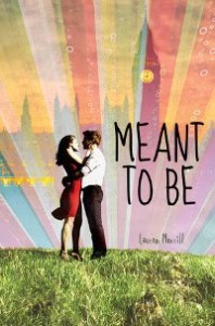
The cover takes an inspiration from natural rainbows, both in having the rainbow in rays like a sun, and having a scene in the foreground. There are colours in the scene, but they’re somewhat muted (note the red dress is not that bright, and has been mostly shadowed out… the grass is somewhat de-saturated). It’s focused on reds and yellows, which goes with the feel-good contemporary novel blurb. It’s also used some rainbow opposites to show the city against the sky.

It does a decent job of implying a groovy psychedelic theme, without going into eye-bleeding territory. The thing I least like is the font choice, but that’s not a colour issue. It’s certainly readable.

The End of the Rainbow – V.C. Andrews

End of the Rainbow Cover

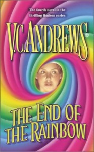
Not only did a unicorn have an accident here, but the magic turned it into a rainbow-vomit whirlwind, which ate the protagonist! Also, the title is in a similarly bright colour so there’s no real contrast. Add in the blurb, which talks about devastating tragedies, secrets and hardship, and someone had too many skittles.

In terms of colour balance, red was shifted to pink, and the yellow/green part is smaller than the rest (possibly in an attempt to make the yellow title text stand out a little more). This wasn’t a successful cover, and it doesn’t surprise me they changed it for the newer version (the new cover barely has any rainbow on, so I won’t be looking at it).

Arclight – Josin L. McQuein

Arclight Cover

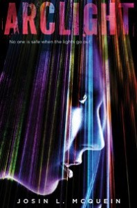
The black background makes the light beams stand out, with white to outline the face without drawing away from the rainbows. A focus on purples and blues is common for speculative fiction, and has been used to good effect here.

Rainbow opposites were used for the title, making it stand out, but also fit with the rainbow theme. It uses the same patterning as the lights, linking the title to the picture.

Crewel – Gennifer Albin

Crewel Cover

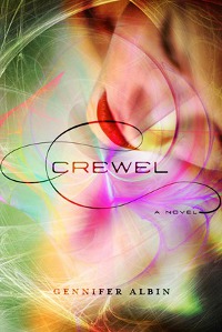
Another speculative book with a different approach. One trick here is the extremes have been minimised. There’s only a hint of violet, indigo and blue. Red is softened to pink for most of it. Saturation has also been used – most of the background colour is less saturated (more subtle than using a grey background, but it’s still there). The swirls are the most saturated parts, and draw the eye (the focal point of those being near the centre, close to the title).

I liked the choice of the pink swirls and red lips as the central colours. It’s playing with cover colour stereotypes, as such colours are usually put on chicklit books. But it’s using them in different ways, with an overall composition that’s more dreamlike and suggests a speculative book. This goes with the blurb about becoming a beautiful and deadly spinster.

Much like Arclight, the title interacts with the picture. It’s dark, so it stands out, but has reddish sections where it crosses the picture.

My Plans

My original idea was a rainbow squid in a black ocean. Arclight was very close to my colour scheme ideas, so I’ve seen it can work.

The debatable point is how bright to make the squid. It could be lit up, as though it’s self-illuminated. It could also be fairly dark, as though a light is being shone onto it. Or a mix of both, with small points of light. As the squid body will take up a fair bit of the cover, I’m leaning towards a darker approach, with some points of light.

Colour-wise, purple/blue is often associated with speculative work, so would be a sensible dominate colour scheme. I liked Crewel‘s play on the cover colour stereotypes, but it’s more of a risk for self-published work. Making the genre easier to identify increases the chances of a reader looking at the book.

I preferred the covers where the title and the picture went together. Meant to Be worked as far as the picture was concerned, but the text seemed separate, as though it was an afterthought. But this decision can come a little later, as I’ll be adding the title digitally. The next step will be drawing the squid, which is a story for another post.

* See the top of the post for a picture of a basic colour wheel.

H2O: Just Add Water (Season Three)

H2O: Just Add Water (Australian Season 3 DVD Cover, with Bella in foreground)

H2O: Just Add Water is a mermaid series for teens and tweens, which ran for three seasons between 2006 and 2010. Part 1 (over here) considers the series in the context of other mermaid media and reviews season one. Part 2 (over here) reviews season two. Part 3 (this section) deals with season three, wider themes/issues and the upcoming spinoff series, Secret of Mako Island.

(Due to covering three seasons, there are some inevitable spoilers and a few stand-alone episodes are discussed in more detail. However, I’ve avoided discussing the season finales and there will still be a lot of surprises.)

Review: Season Three

Plot Overview

Emma is off travelling with her family, so Cleo and Rikki are left alone. The Juicenet Cafe has closed, and Zane buys it, so that he can run it with Rikki. On the night of the opening, a water tentacle attacks the girls. New girl in town, Bella (Indiana Evans), jumps in the water to help, revealing she’s a mermaid.

The girls travel to the Moon Pool, where they find freediver Will (Luke Mitchell). He’d swum in through the sea entrance and was knocked unconscious by the tentacle as it appeared. They tell him it was all a hallucination, but Will is uncertain.

Now the girls have the mystery of the tentacle to solve, along with trying to get through their last year at school.

Antagonists

The main antagonist is Sophie, Will’s sister. She’s ruthless in the pursuit of profit, so it’s not that she has a personal issue with the girls. Unlike previous antagonists, she has no interest in mermaids. It’s simply that she has no qualms about what happens to anyone who gets in the way of making money.

Despite this, there are signs she does genuinely care about Will. It’s just that she loses sight of it sometimes when money is at stake.

Allies

Lewis is still around at the start of the season, but heads off part way through. Taking up the slack is Will, a talented freediver who’s being pushed to go professional by his sister.

Mermaid stories usually de-emphasise human aquatic abilities. Mermaid allies may well be poor swimmers. If they’re comfortable in the water, it’ll be related to a surface water sport. Having an ally who can hold his breath and swim to reasonable depths is unusual. It also works well, because it gives Will an understanding of the mermaids that other allies have lacked (and it’s not as though freedivers will ever be mermaid replacements… even a talented human can’t swim as fast, or hold their breath for as long, as the mermaids).

It does mean he has an initial mermaid squee reaction to finding out mermaids are real, but he settles down soon enough, and comes to see the girls as friends he can share his love of the ocean with.

Overall Views

My criticism of the second season is it took a long time for the plot to get going. This wasn’t the case in season three, where the plot of the water tentacle is introduced in the first episode and builds towards much higher stakes finale than the previous seasons.

Emma was absent as the actress had another job. Lewis was also gone for part of the series for the same reason. Which meant the new characters of Bella and Will were introduced. This did have some advantages, as both Bella and Will have lived very sheltered lives, with a lot of travelling and little time to socialise. The result is they’re still navigating things others might deal with as younger teens, giving space for Cleo and Rikki to face older challenges.

More specifically, Rikki is dealing with running a business with Zane. Cleo is dealing with disruptions at home (her dad meets someone new and her sister is now a teenager), and a new job as a dolphin trainer (which presumably could be her future career).

The pacing of the season was pretty good, with a mix of the main plot and the sub-plots. I liked that the girls were facing more adult concerns. The eventual stakes in the finale got an eyebrow raise from me, but they do make sense in terms of the worldbuilding done for the mermaids in the series. This was a better conclusion than the previous season, and not a bad place to end the story.

Series Overview

Mermaid Design

Turning into mermaids on contact with water and mermaid powers are fairly standard in modern mermaid stories (though I haven’t seen Bella’s water-to-jelly power before). Shapeshifting with all worn items is a little more unusual. Most mermaids transform naked and have to find clothes. But given the short episodes, it’s a lot easier for filming to have them shapeshift complete with clothes (and they do use the idea in fun ways, such as Emma dying her hair red as a mermaid, but it staying her original colour as a human).

The most unusual thing with the mermaid design was the reactions to the full moon. Seeing the moon or its reflection can cause them to act like they’re intoxicated and possibly give them temporary abilities. As the girls spend more time as mermaids, this lessens, but the moon cycles remain significant.

The girls themselves joke about it being werewolf time, but it does make more sense for mermaids than werewolves. The moon has a big impact on the oceans, so the idea that mermaids would be sensitive to it isn’t that far-fetched. As the series progresses, it becomes clear it’s more complicated than that. The position of the planets and other heavenly bodies also has an impact. And there’s a suggestion about why this might have come about in the first place.

Continuity

There are issues with continuity in the story. Some are likely budget concerns, as actors aren’t rehired after their part of the story is done. It would’ve been interesting to see what Charlotte was up to in season three or to see Miriam from season one develop as a character. Perhaps to have the girls go to Miss Chatham or Max for advice sometime. These people wouldn’t have all vanished mysteriously in real life.

Others are clearly mistakes. Ronnie turns from a wild rescue dolphin to a captive bred one. Rikki forgets that Cleo has painful singing.

Generally though, the continuity isn’t too bad. There are some fun things that carry over, such as Lewis using his spiral lure anytime he fishes.

Racial Diversity

When I first saw the cover photo, I did wonder about Phoebe Tonkin’s (Cleo’s) race* (and judging from my internet searches, other people have too). However, she seems to identify as white and she’s portrayed as white in the series**. And she’s as dark and non-Northern European as any main characters get.

There are some side characters of other races, so if anyone’s about to argue that everyone in Australia is white… no, they’re not, and clearly they had no issues finding non-white actors for background parts.

Given that the series ran for three seasons, with eight different mermaids plus assorted love interests, they could have widened the net for their main character casting choices. As well as general issues of diversity, it reinforces the trope of non-white people never getting to be the cool non-humans (and thus never the centre of supernatural stories).

Romantic Relationships

All of the relationships are between a boy and a girl. This may not be something the writers can control, as the networks often insist on that for child and young teen shows. But it’s still something that needs mentioning, because somewhere along the line, someone’s deciding that only heterosexual children and teens get to see themselves and their issues.

On a positive note for the show, it doesn’t glorify abusive stalker relationships. When the boys act in ways that are controlling, this is shown as a bad thing. The girls also aren’t vilified for handling relationships their own way. They can break up with boyfriends, have different boyfriends or not date (they’re not all actively dating when the series ends). However, it did bother me that all the boys had controlling moments. Even though the narrative tended to slap the boys when they tried, it would have been nice if at least one of them didn’t feel the need to try.

Cleo and Lewis’s relationship was good to see after a few too many books. Young adult novels are a little prone to partners who are fated to be together, like it or not. This predestined bond gets used as an excuse for all sorts of abuse. So seeing a one-true-love setup where there’s no predestination, only two people who’ve grown up together and are close friends, is nice.

Women in Science

The handling of women in science wasn’t ideal in the first season. Though Doctor Denman is portrayed as being a talented scientist, she’s also the target of appearance-based criticisms (that she can’t be a real scientist due to being pretty). The girls generally avoid science, leaving it to Lewis.

The second season has Cleo fail biology and need to retake it, because she can’t cope with science. Though her student mentor is Charlotte, and Cleo does pass after her extra study, there’s still a vibe of science not being for girls.

This turns around in the third season. Cleo and Lewis work together on analysing the tentacle and Moon Pool. When Lewis leaves, Cleo continues the study, and is also shown working hard at science at school. A new science teacher character is a woman, who’s shown as competent, without any of the overtones aimed at Doctor Denman. (Though an eye-roll is directed at the fact Cleo starts wearing glasses in this season.)

Taken as a whole, this creates a character arc where Cleo starts out avoiding science because she doesn’t think it’s for girls, slowly realises she can do it if she studies, and starts to become enthusiastic about it by the end. I don’t believe this was the plan from the start (season three wasn’t in the original plan), but it was a reasonable way to redirect problematic elements of season one.

Final Summary

There are issues with the series. Season two flounders, and the way side characters vanish is a sign of budget considerations. There’s also a big lack of diversity among the main cast. This is an issue in mermaid shows and films in general, but H2O didn’t exactly decide to break the trend.

However, I enjoyed it overall. The mermaid lore went to some interesting places, and I liked that the personal issues the girls face age with them. The visuals are nice, the characters are relatable for the intended audience, and it’s generally strong on its depiction of women and girls (and where it’s not, it’s a talking point***). If you’re looking for something generally fluffy and fun, plus mermaids, H2O is one to watch.

The Secret of Mako Island

It is good to show that boys can be merpeople too (or fairies or riders of sparklie pink unicorns), but it needs to be done in a way that doesn’t backslide to the old male-centric focus, where girls and women were just the accessories in the stories of the men.

This test is coming up for the makers of H2O with their next series, The Secret of Mako Island. In this, Zac falls into the Moon Pool and gains merpowers (early sources disagreed on whether he gets a fish tail or finned feet… but the promotional photos show a tail). This causes problems for three mermaids guarding the pool, who grow legs and head onto land to find him.

Potentially, this could go very wrong, becoming a story where Zac’s needs are the core of the story at all times. However, if they create a friendship group much like the mermaids and Lewis in the previous series, it could work. A boy as part of the group is different from a boy dominating the group.

The series does address one of the H2O issues. Zac’s actor – Chai Roumune – is mixed raced Thai/White Australian, which is a first for the merpeople (or any of the main characters) in the franchise. How well they handle this will be one of the areas I’ll be looking for when the series is available.

On a story level, they need to find new places to go. It does look set to continue developing the mermaid lore, with sea-dwelling mermaid pods (something hinted as possible in season three, but not actually shown). There have been promotional shots of an older mermaid instructing the three girls, so there’s potential for showing pod politics and family.

For now, I’ll remain cautiously optimistic.

* Based on the cover image for this post, you might wonder what I mean about Phoebe Tonkin. She looked more obviously different in the season one cover photo, and appears to have been lightening on the covers as the seasons have gone on.

** The distinction between character and actor is important. It’s not unusual for lighter non-white actors to be paled down and given Northern European family members, in order to portray them as white characters. It’s also not unusual for mixed race characters to be played by white people.

*** I grew up chatting about the things I watched with my parents. And later with my friends. I learnt a lot about social issues that way. So I look for the potential for being a conversation opener in series for younger viewers. You’re never too young to start analysing what you watch.

Fungi Anthology Available

Fungi CoverThe Fungi anthology by Innsmouth Free Press is now out (the official release date is 1st December, 2012). It has a mushroom person on the cover! You can’t get much more shiny than that. When my contributor’s copy arrives, I’ll put it on the shelf and admire the mushroomness.

But back on the word part. My story is called Letters to a Fungus, and is a bunch of letters written to a fungus. Admittedly, I don’t get any elaborate title points for that one*. It’s also my first published story about fungi, which is funny considering how much I like them.

The basic inspiration was giant fungi, such as the one discovered in Oregon. People tend to assume the mushroom is the fungus, but a lot of the mushrooms in an area may be produced by a single fungus (much as a bush may have lots of berries, but it’s still a single bush). As fun as mushrooms can be, we shouldn’t ever forget the real body of the fungus is out of sight, and might not be what we expect.

The Fungi website has a short piece on why they picked my story, and my answer to, “Why write about fungi?” (Though I’ll note I’m not a gigantic mushroom with a laptop**.) The Innsmouth website has a page with purchase information, including links to online shops and the option to buy directly from the publisher.

There’s also a Goodreads giveaway going on, ending on December 31, 2012. It’s open to people in the US, Canada, UK and Australia. You can add the book to your to-read list, or review it, from the Goodreads pages: hardback, paperback and Kindle versions.

That’s all the linkage. If you get hold of a copy, I hope you enjoy it!

* If it’d been a series of limericks written to a cat, and been called Letters to a Fungus, I could call it surrealism. But as it is, it’s one of those stories where people will ask, “What’s it about?” because they don’t entirely believe it really is a series of letters to a fungus. Maybe they’ve never written to a fungus. Some people are anti-fungal like that.

** I’m actually a tiny mushroom with a desktop.

# The art is by Oliver Wetter.

Story at The Tomorrow Project

Happy Yellow StarArc (a new fiction magazine run by the New Scientist people) and The Tomorrow Project are running regular fiction contests. I entered for the theme ‘the future of pleasure’ and was a runner-up.

“Through the Hoops” follows Shaista and Rita Singh, as they practise a futuristic form of parkour / freerunning. You can read a free PDF version, and comment, on The Tomorrow Project website. Or check out Arc’s comments on their Tumblr.

Behind the story…

One of the question posed in the longer description was, What new games will we play?

When I got a 3DS for my birthday, one of the first things I found was Face Raiders*. The game displays the room around you using the 3DS’s camera, and adds on dimensional rifts and aliens to shoot. Augmented reality games interest me a lot more than virtual reality, because it’s not about locking yourself away in a pod somewhere. It’s about getting out and about, only with a slightly different view on the world.

So while thinking about augmented reality, I thought about what you could do in a game the size of a city. The idea of a giant platformer game, by actually having the skills to perform the jumps, was an obvious one.

This has additional conflicts, because the skills needed to navigate a city already exist. Neither parkour or freerunning proponents want it to become a competitive sport. It brings commercialisation and a change in attitude. But with some parkour / freerunning games already existing, it’s easy to see how they might be adapted for an augmented reality system, whether people like it or not.

Though gamers don’t always play by the rules…**

* More accurately, my critique partner found it, photographed himself very badly as the first alien, and then I took it back. I’ve refused to delete the bad photo. He’ll have to live with me shooting at him.

** How quickly can I kill all the Lemmings? How many Earthquakes does it take to destroy a city? How far can I run through the dungeon naked before a dragon eats me? Let’s lock all my Sims in a room and set it on fire!

The Memory Eater – Matthew Hance (editor)

Memory Eater Cover - Cartoon head with pink bird eating the exposed brain

First Published: 19th June, 2012
Genre: Science Fiction / Short Story Anthology
Authors: Myra R. Taylor; John W. Otte; Ken Liu; Matthew Hance; Joe DiBuduo; Kate Robinson; Mike Kozlowski; j l mo; Lisa Martinez; Nicholas Conley; Wesley Gray; Bob Simms; Lisamarie Lamb; Lauren Kocher; Nina Pelletier; Kim Charles Younkin; Holly Day; Alex Shvartsman; Cassie Davies; Chad Jones; Justin Swapp; DL Thurston; Vivian Davenport; Lauren C. Teffeau; Kathie Huddleston
Available: Amazon.com | Amazon UK

The anthology is based on the premise that unwanted memories can be erased by a machine. Themed anthologies can suffer from the stories being too samey, and that was a big problem here. I read the first couple of stories, but after that, I skipped and picked a few at random from the rest. I’d hoped to see more of a range of situations, but the ones I chose all read as though they were set in near-future America, and focused on a heterosexual relationship problem. One story had a gay man being murdered for getting in the way of a different sex relationship, which is a negative trope I’d rather not ever see again, especially in an anthology with a heterosexual focus.

It’s possible there are some standouts in the ones I didn’t read, but I had no motivation to give the rest of the stories a chance.

When I first reviewed this, I said the stories were anonymous. Author names and bios are in a list at the back, but who wrote which story isn’t identified in the bios or on the stories. This was unfortunate as a reader (as I do like to know who authored a story, for better or worse) and bad for the authors themselves. I later realised there was a table of contents, but the book didn’t open to that page and it wasn’t the built-in table of contents Kindle recognises. All round, not a good way to format an anthology.

On the plus side, I didn’t see any issues in the editing and each story was illustrated. If you’re a fan of the themes I’ve mentioned, this might be for you.